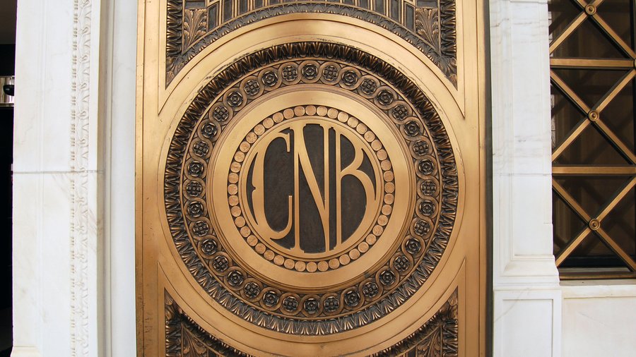
Hundreds of typophiles descended the last few days for TypeCon2015: Condensed, a conference for lovers of good kerning, ligatures and all things typography.
What can business folks learn from a group like this? Well, typography is the bedrock of branding, the architecture supporting the visual face of a company.
The Denver Business Journal (and our 39 American City Business Journals sister newspapers in other cites) use only two font families in their print publications and websites: Acta (serif), and Graphik (sans serif). These families provide a wide range of expression while providing a consistency of message.
Apple Inc.'s products and stores look so good because a single typeface is used with a lot of thought and care. And Starbucks Corp. brilliantly uses design to support its branding message; everything about its store design and packaging re-enforces the idea of selling its unique experience.
The Condensed conference is put on by the Society of Typographic Aficionados. Speakers presented on a variety of topics, such as "Examples of Double-Sided Wood Type" (letterpress type that was used for a letter on one side, and sometimes a beautiful illustration on the back).
Another talk considered the endless possibilities in modern Farsi type design. Yet another presentation considered the implications of how culture impacts a place's lettering. While Miami has a very Latin beat, Austin is big in a very Texan way.
Denver, of course, is influenced by its western past, mining and the outdoors. Type historian Paul Shaw turned his encyclopedic knowledge of lettering to downtown Denver with a walking tour of the city's lettering history.
Click the big photo above for a slideshow of the walk.
And if you know of any other examples of impressive lettering around metro Denver, send me a JPEG photo via email to jcarr@bizjournals.com, with "typography" in the subject space.
Not fully lettered on the terminology of typography? Here are some key terms:
GLOSSARY
- Baseline: The imaginary line upon which letters appear to rest.
- Character: Any letter, numeral, or punctuation mark in a font.
- Descender: Any part in a lowercase letter that extends below the baseline.
- Font: The digital file or metal type consisting of letters, numbers and punctuation that make up a particular size, weight and style of a typeface.
- Foundry: A company that designs and/or distributes typefaces
- Kerning: The space between pairs of letters. It is used to correct spacing problems in specific letter combinations such as “VA”.
- Ligatures: Special characters that are actually two letters combined into one, such as "fi." They allow letters to flow together more gracefully to improve legibility.
- Point: Type sizes are generally expressed in points. There are 72 points to one inch.
- Typeface: The design of a font, usually including regular, italic and bold variations. A collection of various weights of a typeface is a family.


